Project background
A large FX trading firm, hugely successful in East Asia region has decided to expand to global market. My goal is to improve the usability of their iOS/android application and make it suitable for global markets. Working closely with stakeholders and the tech team we were able to determine a direction to improve the product. Due to NDA, I am limited in the information I will provide so this is more of a general overview.
My role and responsibilities
· Add new features
· Create improved UI
· Improve client onboarding
· Improve accessibility
· Improve conversion rates
· Improve multi-account functionality
· Improve copy trading functionality
· Lead production team through each iteration
Research and analysis
Each regional office conducted user feedback operations to provide us with insight into how local clients use the applications and what they expect/require to improve their experience. I also conducted personal usability testing workshops and monitored users personally (Guerilla)
Findings include the following factors which affect the UX of the application:
· Inaccurate language translations.
· Quality of existing applications available in regional ecosystems.
· Cultural design aspects differ.
· Unnecessarily long onboarding processes.
· Trading is complicated by nature, difficult for novice users to understand.
Competitor analysis – Onboarding
From initial analysis of the app, I immediately noticed the unusually long onboarding process, upon inspection my assumption was correct in comparison to competing apps. My first task was to shorten this process to industry standard or better. Imaged blurred for security.

Goals and objectives
Based on research and analysis I had decided to implement the following changes.
· Simplify and shorten onboarding process.
· Add new and unique features to create a market disrupting application.
· Add geolocation targeting to the application to allow us to customise for each region.
· Add events tracking to each screen in the onboarding process and identify pinch points.
· Add an interactive tutorial mode to guide novice users through onboarding and trading.
· Provide translation files to each office to translate languages expertly in local dialect.
Information architecture & user flows
Expanding to global markets requires an improved and vastly complicated geo-logic. This will allow different users to experience different onboarding and features based on their location. Imaged blurred for security.

Wireframes
The below wireframe model will provide the basis for the entire application.

Design concepts
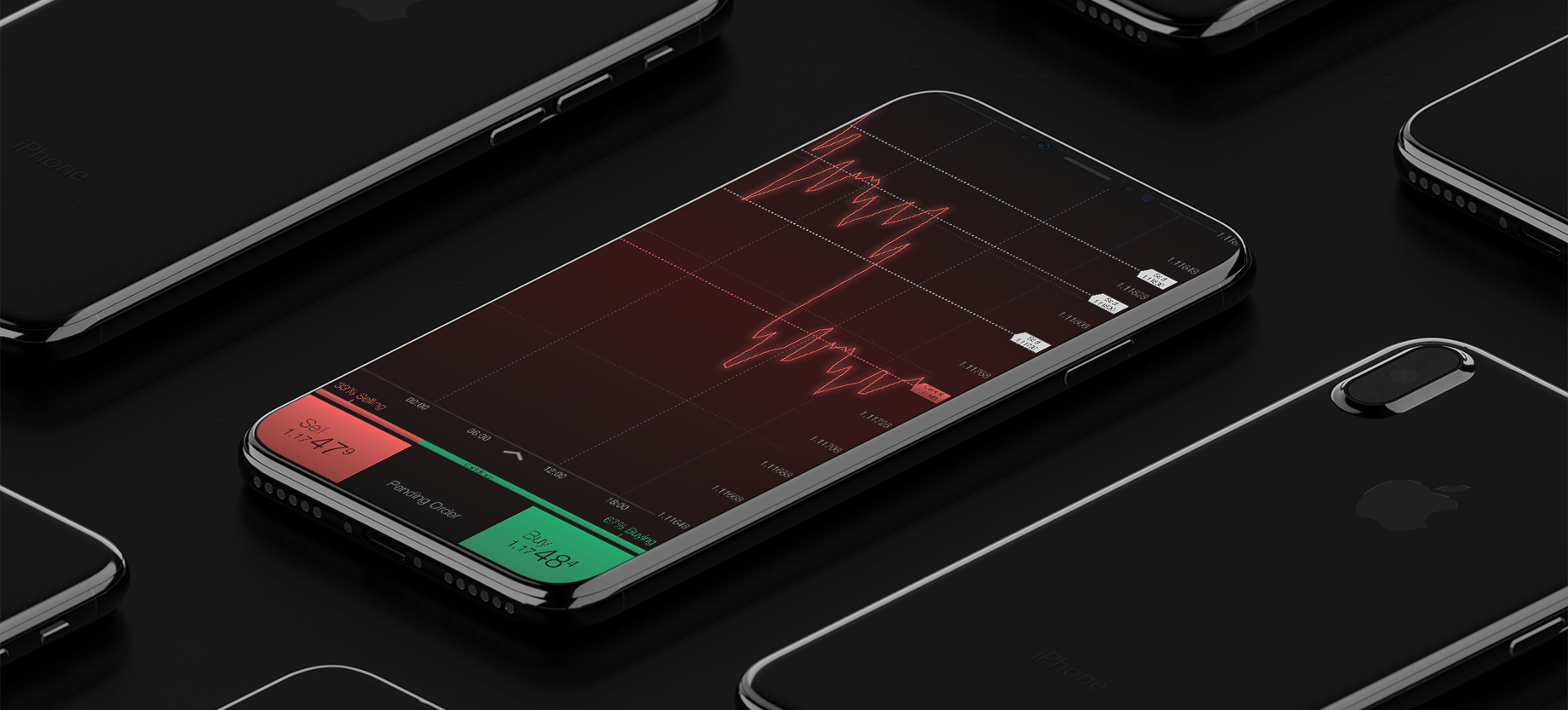
The first decision was to move to a dark, more professional palette based on the latest design trends (Dark mode anyone?)


Style Guide
After conducting quantitative testing methods, the business decided to implement the V5 emoitive dark design. The initial brief of phase 1 was to create a full style guide and pattern library. By doing so, development efficiency could be improved exponentially and designs across the board would be much more consistent.

The second and most important decision was based on the Watchlist page. When going through my various design iterations and user research my largest challenge was to create a watchlist view which catered to all tastes. Finally, after extensive conversations with the dev team. I created a new "View" feature. This will allow users to select from one of three views based on their requirements.
.png)
New features
Below is a list of new and unique features based on business requirements, user requirements and unique selling points I devised based on a usability perspective.


Final Design
The Masterpiece.
.png)